
( 00-01 )
ABOUT THE PROJECT
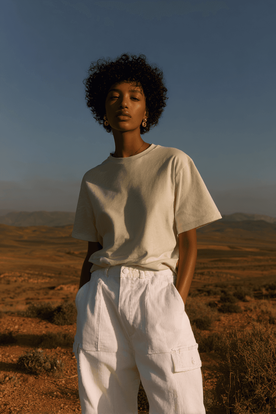
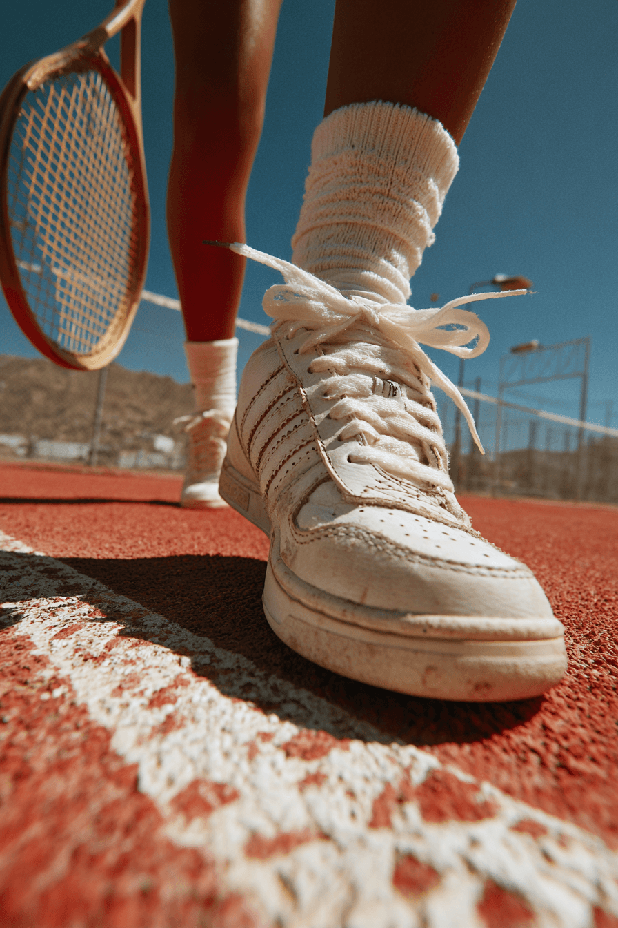
ARK looked good, but didn’t feel like a leader. It had the usual Instagram-friendly aesthetic — minimal logo, muted palette, clean product shots — but no soul. It blended into a sea of same. What ARK needed was a brand that could own the space, not just exist in it.
We rebuilt the brand to lead, not follow. That meant real personality, bold design, and a voice that matched the energy of the athletes it served. The goal was to turn ARK into a serious name in sports — one with presence, attitude, and longevity.

( 00-02 )
CHALLENGES
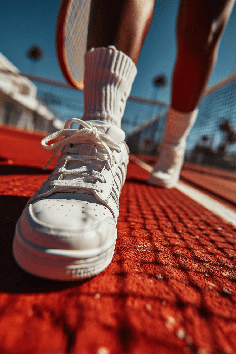
The challenge wasn’t making it cooler — it was making it stronger. The brand had all the visual polish, but zero edge. It wasn’t speaking to the right audience. It felt like a lifestyle brand in a performance category. That gap was losing them customers who wanted more substance.
We had to reposition ARK without losing its visual foundation. We kept what worked — clean design, aspirational imagery — but added tension, clarity, and real competitive weight. From typography to tone of voice, every decision pushed ARK closer to something iconic.
( 00-03 )
SUMMARY
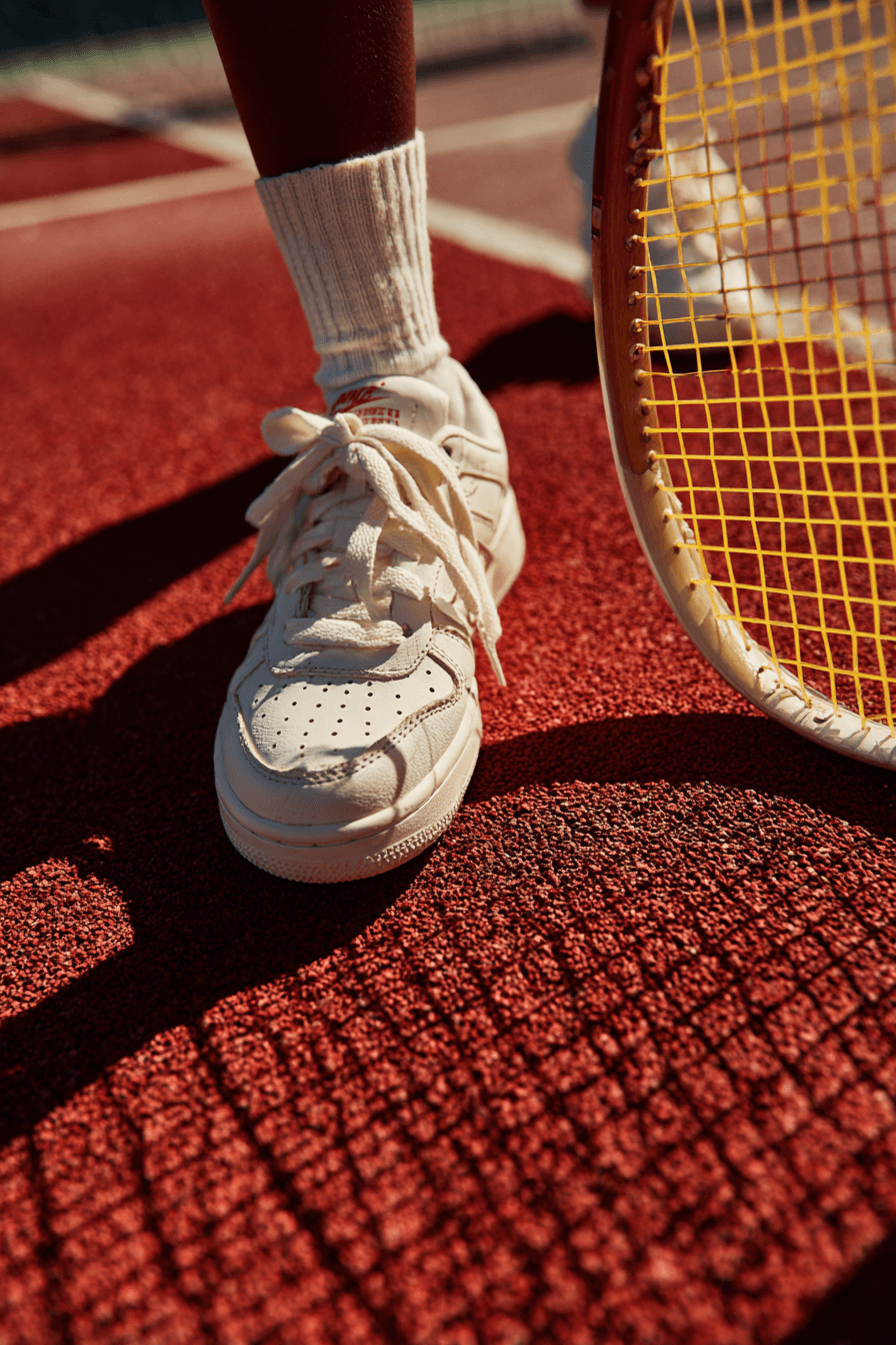
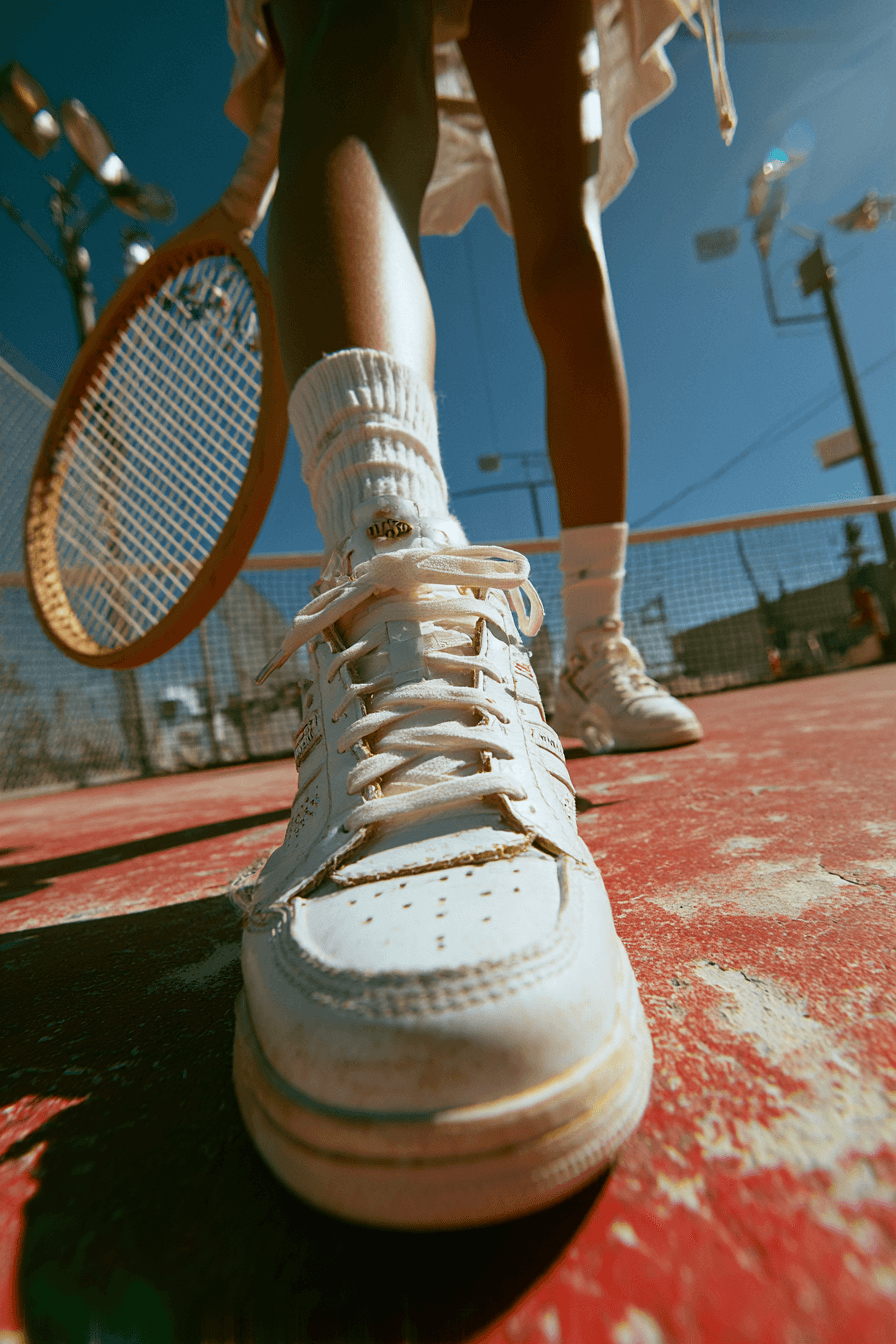
The new ARK doesn’t just look premium — it feels built to win. The brand now carries focus, intent, and personality across every touchpoint. It speaks to athletes, not just trend followers. And it shows up like a brand people can actually trust.
We delivered a full brand refresh including strategy, identity, voice, and rollout across packaging, digital, and social. The rebrand helped ARK drive higher retention, stronger community engagement, and opened the door for key retail partnerships. Not just better — category-leading.
( 00-03 )
DISCOVER MORE